Week 1: Draw 21 Days Challenge

Illustrative designer Von Glitschka threw down the graphite gauntlet with his 21 day drawing challenge. The first day was easy peasy–draw a cat–done!

Day 1: Draw a cat.

Day 1: Draw a cat.

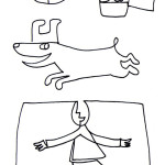
Day 2 was a bit more complicated. The challenge was to draw continuous line drawings of five specific things: a smiling face, a hand holding a soda bottle, a dog running and a man on a unicycle. I liked the continuous line challenge because it makes you think about how to “design” your drawing in order to not lift your pen off the paper.

Day 2: Continuous line drawings.

Day 2: Continuous line drawings.

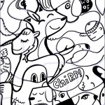
Day 3 was a fun drawing exercise called “draw what you see.” Participants downloaded a page of squiggles and were instructed to draw what they see, much like the way we “see” shapes when we looks at clouds.

Day 3: Draw what you see.

Day 3: Draw what you see.

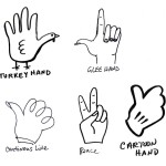
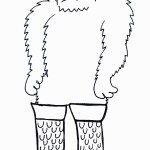
Day 4 was draw your non-dominant hand in 5 different styles (this was a tough one for me), and on Day 5 we were asked to pick from a list of subject matter; I chose Bigfoot. As I kept drawing bigfoot I realized I needed something other than just big feet so I gave him Kiss style boots.

Day 4: Hands.

Day 4: Hands.

Day 5: Bigfoot.

Day 5: Bigfoot.

Week 2 is off and running with new challenges from Von Glitschka. You can check out the Vonster’s website: Glitschka Studios or follow him on twitter: @vonster.

Work in Progress: Interview Magazine Doodle-Bomb

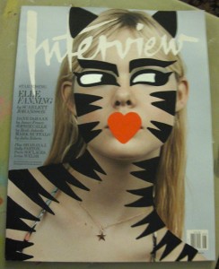
Yesterday I started a new magazine doodle-bomb and I thought it would be fun to post “in progress” pictures. I’ve always been fascinated by the creative process and how ideas take shape.

Demure cover model transformed  into Tiger Girl!

Demure cover model transformed into Tiger Girl!

So far the cover model is covered in my signature “kattsy stripes.” I played around with some clear acetate overlay to think out some background ideas but because of the glare I didn’t photograph the magazine with the acetate overlay, but I’m thinking of continuing the animal print theme with the background.

Putting Markers to the Test

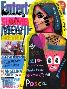
It’s no secret that I love Posca markers and how opaque they are, which makes them great for working on canvas or doodling. Today I am putting many different paint markers to the test on one magazine cover. If it’s opacity you are seeking, Posca, Zig, Molotow and Marvy Bistro clearly have the edge—just see for yourself how the colors pop over Angelina’s dress! And a black Sharpie (the three stripes on her cheek) is always a fine choice for doodling on a light colored surface.

What surprised me in this test case was how poorly Montana paint markers performed. I had to keep priming the marker continuously as I wrote its name out. It appears that Montana paint markers are in the same class as Liquitex and not meant to be opaque. I filled an empty marker with a mix of two different Golden Hi Flow paints which  did very poorly, too (see the purple-pink color outline on Iron Man). I had high hopes for the Golden Hi Flow paints and am disappointed in how they performed.

Various paint markers on EW cover.

Various paint markers on EW cover.

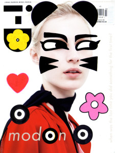
I didn’t expect outstanding results from all of the markers, but I wanted to test many brands on one cover, especially the brands I have written about in previous posts. Admittedly the paper for the magazine is just your average cover stock—not as glossy or thick as many fashion/lifestyle magazines. However, heavily varnished paper can present a whole new set of problems even for Posca markers. To draw on the ID magazine I turned to a Sharpie for the black and still used Posca for the other colors, but I found I had to pump the marker a lot and create a large thick pool of color to make it work.

ID Magazine muse

Heavily vanished cover paper on ID.

Luckily for all of us, the inside pages of a magazine are generally very easy to doodle on with just about any marker, pen or pencil you have handy. So why not carry a magazine and some markers with you; it’ll be like having your very own sketch or coloring  book.

A Doodle-Bomb by Any Other Name.

When we are young we draw on everything with anything; we draw inside and outside the lines—when you’re young anything goes. By high school we are drawing all over our notebooks, often filling up the margins around the notes we are taking. I remember drawing, or doodling if you prefer, over books and comics as a kid. I especially enjoyed drawing mustaches on everyone I’d see in print, even dogs! As a teenager I’d often give magazine covers and advertisements the Andy Warhol faux silkscreen treatment. Sometimes a blank sheet of paper or canvas can be intimidating, so drawing on a magazine or ad can be liberating.

“Doodlebombing,” “doodle-bomb,” “re-cover” and “mixed media” are accepted terms for drawing over photos or magazines. I wish there was a better term for this thing most of us have done in our lifetime. In the digital age, “collage,” “photo-montage,” and “mixed media” are terms often used to describe the same process. The world of graffiti has so many words to describe everything from tags to bombings (a good short read on the subject can be found on weburbanist.com post: Graffiti Designs & Styles: Tagging, Bombing and Painting).

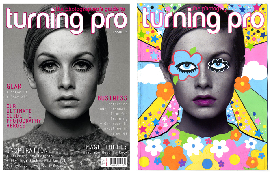
When I started posting my doodlebombs I felt alot of my friends just didn’t get it. Why would I draw on a magazine when I could draw on a blank sheet of paper? The short answer is “why not!” Doodlebombing is just another form of creative expression giving one the chance to play art director and illustrator. I think maybe every now and then I need to post a before & after picture or ‘work-in-progress’ photos to help show the creative process of a doodlebomb.

TwigBandA2

As you can see the before & after pictures of my Twiggy doodle-bomb, I echoed one of her famous Vogue covers by drawing a flower over the eye and created a mod, psychedelic ’60s look for the background. (I like my work to have a sense of history if possible).

Doodling on a magazine can be as involved as you want it to be or as simple as using a black marker. You can draw on anything you like—even a banana or a grain of rice, as seen in Turtle Wayne’s Blog post 10 Fun Things To Doodle On.
If you are looking for a supportive group of doodle lovers I suggest Doodlers Anonymous they even have a tumblr devoted to the craft: Doodlebomb! To see more of my doodle-bombs please see my flickr album: Doodle-Bombs.

Happy Doodling!

Paint Marker Opacity and Translucency

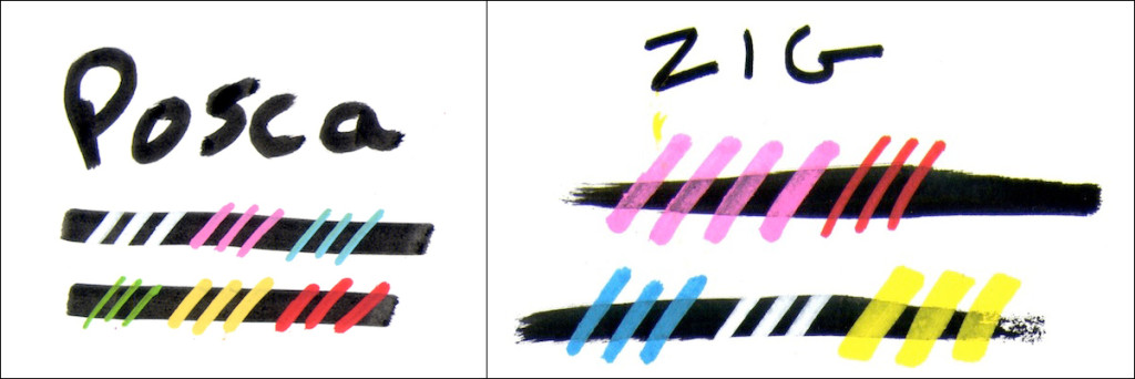
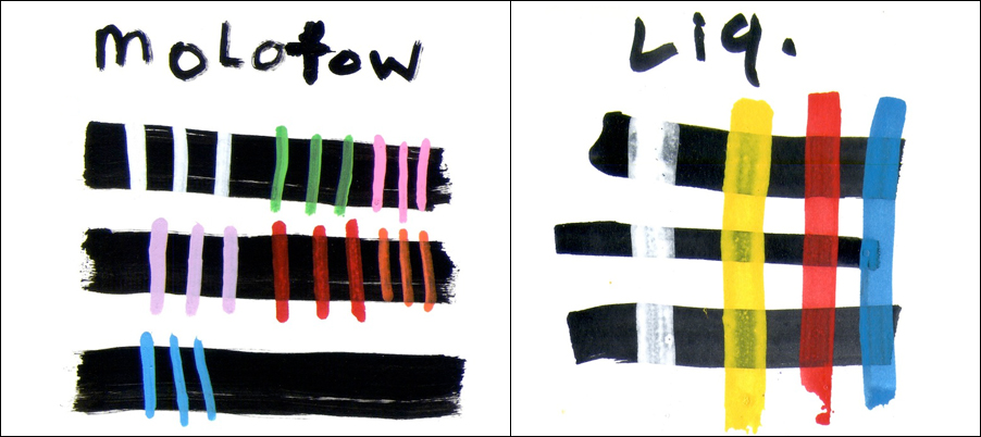
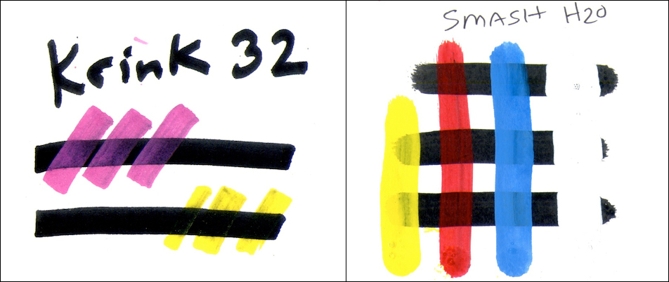
Opaqueness (or opacity) is very important to me when choosing a paint marker. A nice flat vibrant opaque color is what I want in a paint marker. Today I thought I would share some tests I created for this blog. The paint markers in this test are: Posca, Zig Posterman, Molotow One4All, Liquitex, Krink K 32 water based paint markers and Smash H2O. All of the markers in my test are water based and the images on the blog are on smooth (hot press) bristol board, but nearly identical results were obtained using a rougher and more porous board. In each test I drew a thick black line (with the same brand marker) then single-pass strokes of the lighter colors over the black.
Posaca-Zig
 
Posca and Zig are both very opaque as you can see from these tests. The downside to Posca and Zig markers is that they are not designed to be refilled, so once the marker runs out of ink you need to buy a replacement. Both markers come in a wide variety of colors and sizes.
MolLiq
 
The Molotow test swatches look more opaque than Liquitex. Molotow One4All markers are an acrylic-based hybrid paint which can be refilled and come in a range of colors and sizes. Liquitex markers are semi-translucent and behave like acrylic paint. Like Molotow, Liquitex offers a wide variety of products including spray paint that are compatible with the paint markers.
krinksmash
 
Krink makes a lot of  products that I love (especially their oil-based mops) so when they created a water based paint marker I had to buy a few markers and take them for a spin. As you can see the Krink K 32s are very translucent compared to Posca or Zig markers. I hope to find a place for the Krink K 32s in my toolbox. Smash H2O drip markers are also very new to the market. The drip markers come in two sizes: a 1.5 oz drip I used for this test, and a 4 oz mop. I really like the smaller 1.5 oz drip markers even though they are not completely opaque–the colors are vibrant, the drips are incredible and when the paint dries it has a shiny, glossy look.

Since I currently do not have a good selection of Montana markers I am sharing a link to a video demo by Sive:  https://www.youtube.com/watch?v=Rg41eFqFpYI. Recently I bought a few Bistro paint markers by Marvy, which are available at most craft stores, the neon colors have not disappointed.

If you are interested in purchasing some of these products I recommend shopping at durablesupply.com and  artprimo.com.

The Notorious Zig Biggie

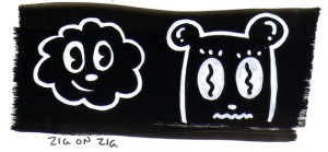
The Zig Posterman Biggie 50 mm and Biggie 30mm markers caught my eye at a local craft store. With coupons in hand I slowly collected the wide markers in many colors.  The gold and silver biggies are especially sweet. If you want a nice metallic marker oil based paint looks the best, but water/acrylic-based markers are getting better all the time. What I like about Zig Posterman markers are the Biggies for XXL hand lettering or for making large swatches to doodle over.  Zigs can be pretty opaque especially if you go over the line at least two times as I did in the cloud and bear face drawing below. The image may look a bit “ghostly” if you only apply one coat of paint marker over a dark swatch. The Zig Biggie markers can be messy after priming the marker to enhance the ink flow so be careful. The paint markers are water-based and become waterproof according to the company’s website.

Zig Marker opacity test: white on black. Full disclosure--the white Zig marker has been strengthened with a second layer on top of the black Zig Biggie 50mm swatch. 150 lb Canson illustration paper was used for this test.

Zig Marker opacity test: one stroke of a black Zig Biggie 50mm with two coats of white Zig on top. 150 lb Canson illustration paper was used for this test.

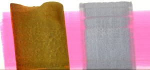
Here is an example of gold and silver over a pink swatch. Each paint marker is a Zig Biggie 50mm. I only did one stroke with each color. 150 lb Canson illustration paper was used for this test.

Here is an example of gold and silver over a pink swatch. Each paint marker is a Zig Biggie 50mm. I only did one stroke with each color. 150 lb Canson illustration paper was used for this test.

Zig Posterman has a wide variety of marker products to choose from, here is a link to their website: zigposterman.com, they also have some fun instructional videos.

Posca Pazoola!

In 2009 I joined Twitter and met many amazing artists, designers and doodlers from the UK. When I asked what materials they used on a drawing, “Posca” was a popular reply. I learned these water based paint markers are readily available in the UK the way a Sharpie is in the US. Soon after I purchased my first set of Posca markers and was hooked; these markers are very opaque and have vibrancy unlike any other I’ve ever used.

When I first started exhibiting my Posca paintings, I would list “Posca” as one of my media, but I would always get asked, “what’s a Posca?” Later I just wrote “water-based medium” on my descriptions, but if anyone wanted to know specifically what I used to create a certain painting I would fill them in on these amazing markers and where to buy them online. Over the years I have developed my own techniques with these amazing markers.

The water based paint marker market continues to grow; there are many brands to choose from such as Molotow, Montana, Zig Posterman and Liquitex, to name a few. Molotow and Montana offer paint refill systems, which is a great feature, but Poscas remain my favorite. The markers are unique in their opaqueness and eye-popping colors. If you would like to learn more about using Posca pens I recommend drewbrophy.com where you can buy markers and even a dvd.

More about Posca and other water based paint markers in future posts. If you have any questions or tips on using water based markers feel free to post a comment.

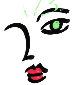
One of my first Posca sketches. Note the way the green and red cover the black.

One of my first Posca sketches. Note the way the green and red cover the black.

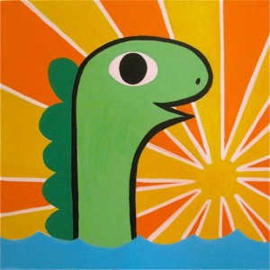
A painting using Posca pens and acrylic paint from 2014.

A painting using Posca pens and acrylic paint from 2014.